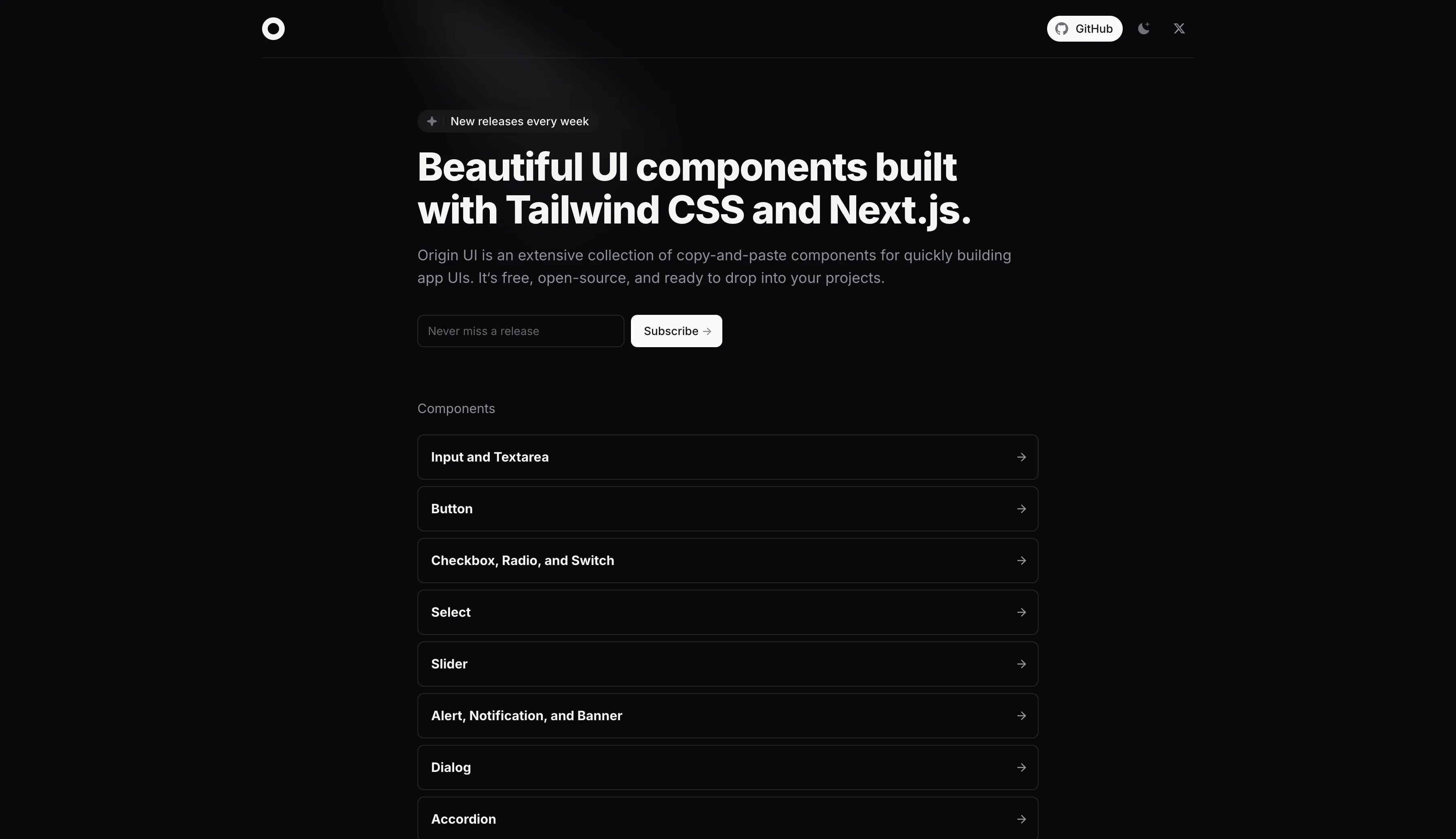
Origin UI is a free React component library with 200+ Tailwind CSS components — buttons, inputs, navbars, and feature sections — ready to copy and paste into your web app.
What is Origin UI?
Origin UI is an open-source collection of React UI components built on top of Tailwind CSS and shadcn/ui. It provides a growing library of beautifully designed, production-ready components that developers can copy-paste directly into their projects.
Unlike full UI frameworks that require installation and lock you in, Origin UI is built on the copy-paste model — take only what you need, style it however you want.
Key Features
- 200+ components — Inputs, buttons, selects, modals, tabs, navigation bars, cards, and more
- Tailwind CSS powered — Every component uses Tailwind classes, making customization straightforward
- shadcn/ui compatible — Built on top of shadcn/ui primitives, integrating seamlessly into existing shadcn projects
- Copy-paste ready — No npm install needed; just copy the component code into your project
- Dark mode support — All components support light and dark themes out of the box
- Responsive — Every component is mobile-friendly by default
- TypeScript — Full TypeScript support included
Example Components
- Form inputs with labels, validation states, and icons
- Responsive navigation bars and mega menus
- Modal dialogs and slide-over panels
- Data tables with sorting and filtering
- Cards, stat blocks, and feature grids
- Pricing tables and testimonial sections
Who is Origin UI For?
Origin UI is ideal for:
- React developers who want beautiful components without building from scratch
- Indie hackers and startups who need a polished UI quickly
- Design engineers who prefer Tailwind utility classes over pre-built design systems
Origin UI vs Other Libraries
| Origin UI | shadcn/ui | Radix UI | |
|---|---|---|---|
| Styled? | ✅ Tailwind | ✅ Tailwind | ❌ Unstyled |
| Copy-paste? | ✅ Yes | ✅ Yes | ❌ No |
| Component count | 200+ | 50+ | 30+ primitives |
| Open source? | ✅ Yes | ✅ Yes | ✅ Yes |
Related Resources
- shadcn/ui — The foundation that Origin UI builds on
- Radix UI — Accessible primitives underlying both libraries
- Tremor UI — Dashboard-focused React components
- Tailwind Blocks — Pre-built Tailwind section layouts
Origin UI
In the same category
Tags
ReactJSUI ComponentsTailwind CSSshadcncomponent libraryopen source
Figma Plugins
ASCII Art Generator Figma plugin
Clip Path Generator
Crosshatch Image Effect Generator
Fancy Text Generator
Figma to Plugin API
Figma to React Bootstrap
Figma to Tailwind CSS AI
Figma to Tailwind CSS
File Thumbnails Generator
Galaxy Background Generator
Geometric Tile Pattern SVG Generator
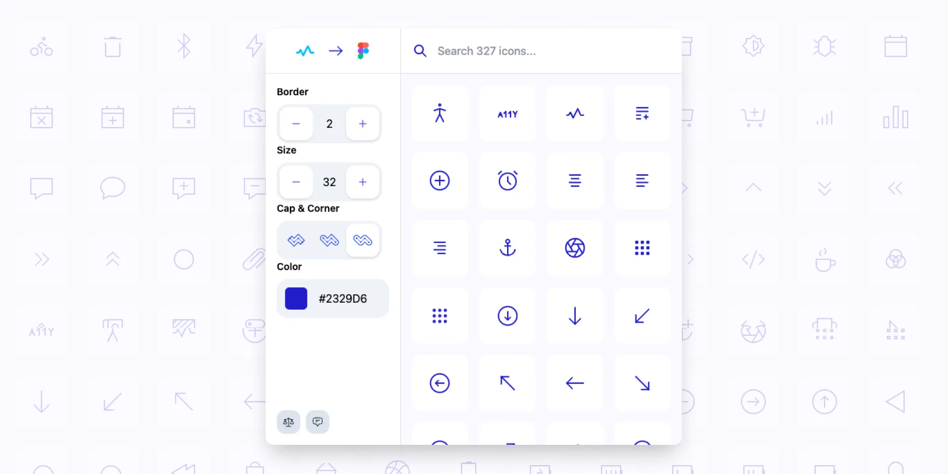
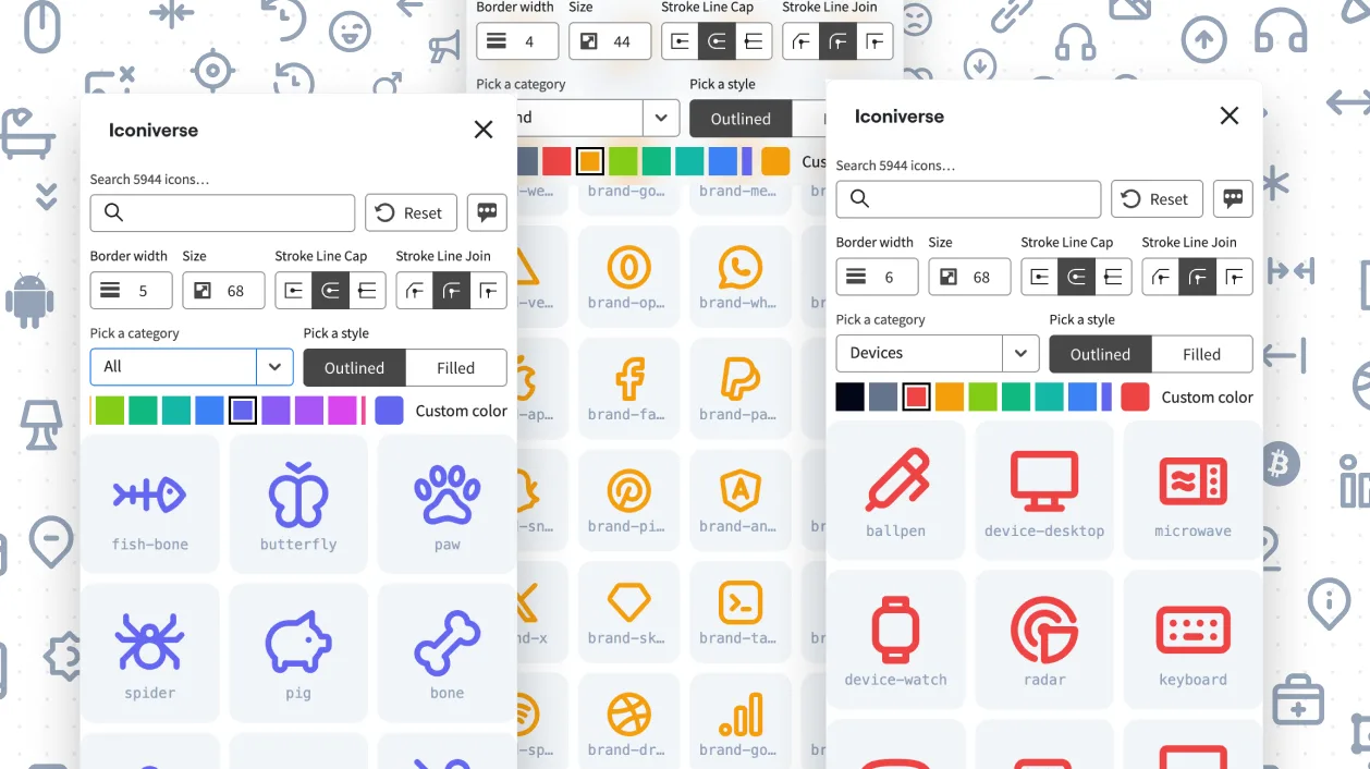
Iconiverse

Ikonate to Figma
Invoice Gen Z
Lorem Picsum to Figma

Neumorphism Shadow Generator
PageGenius Pro
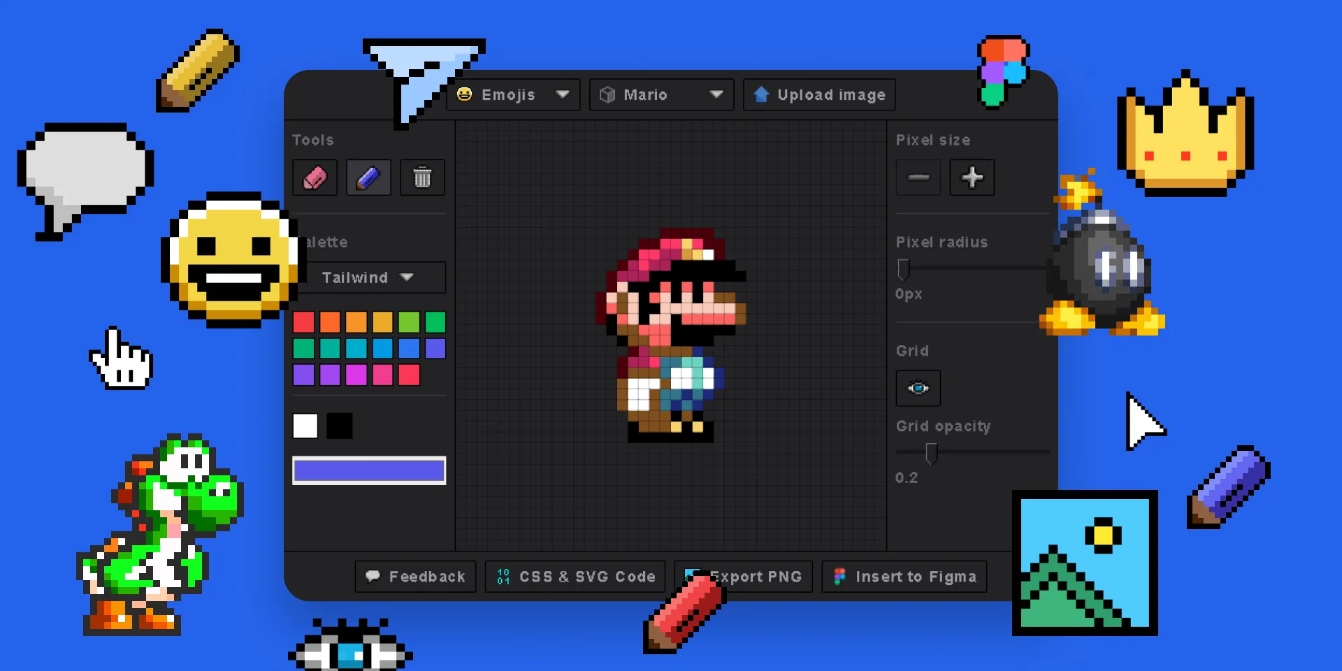
Pixel Art Generator
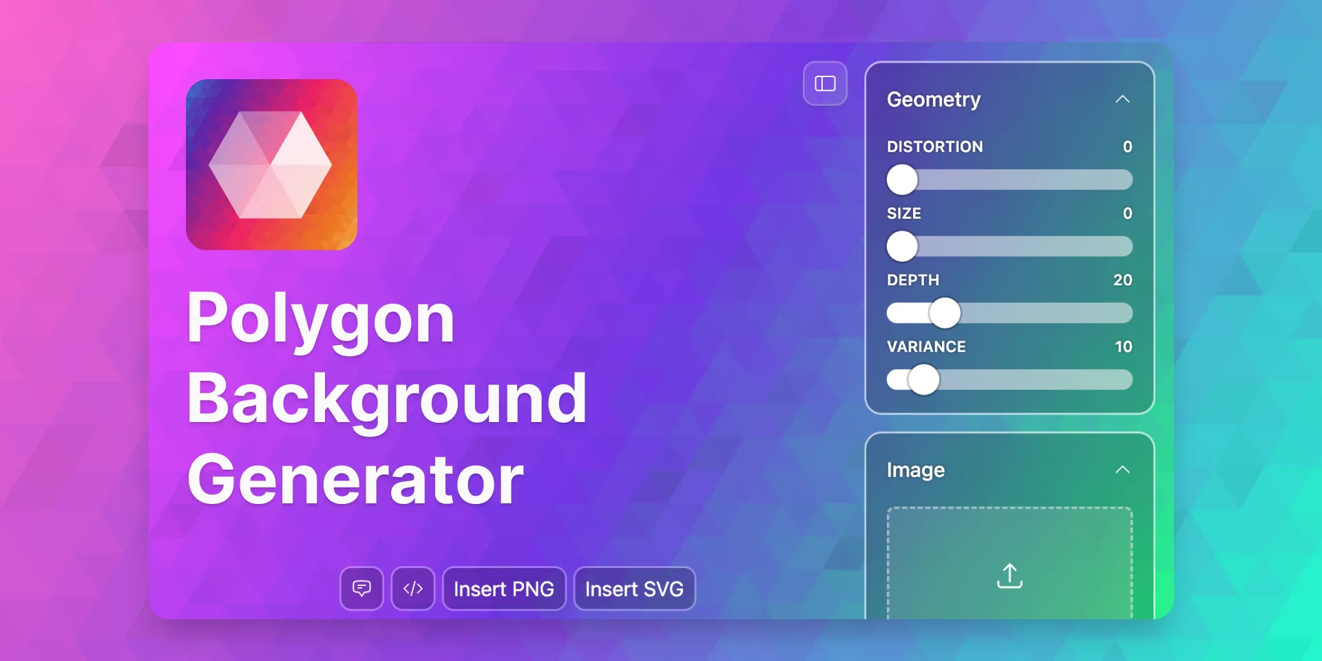
Polygon Background Generator
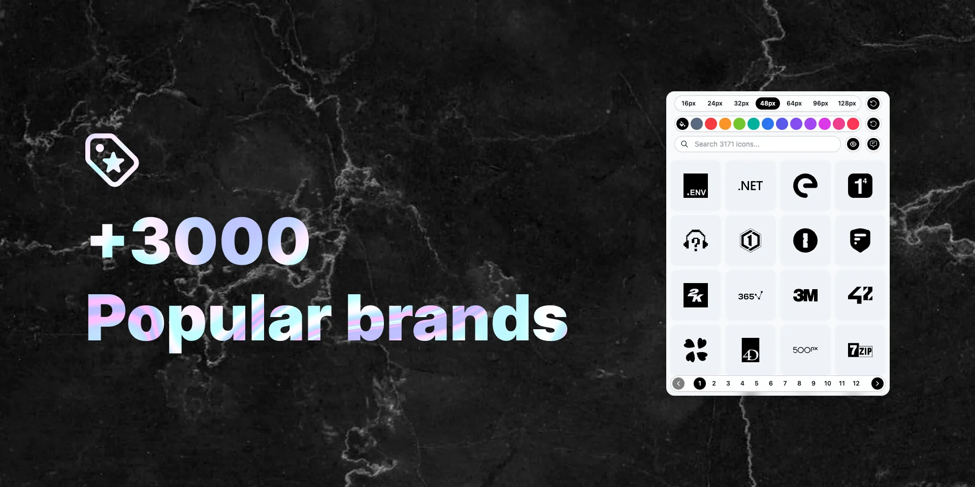
Popular Brand Logos
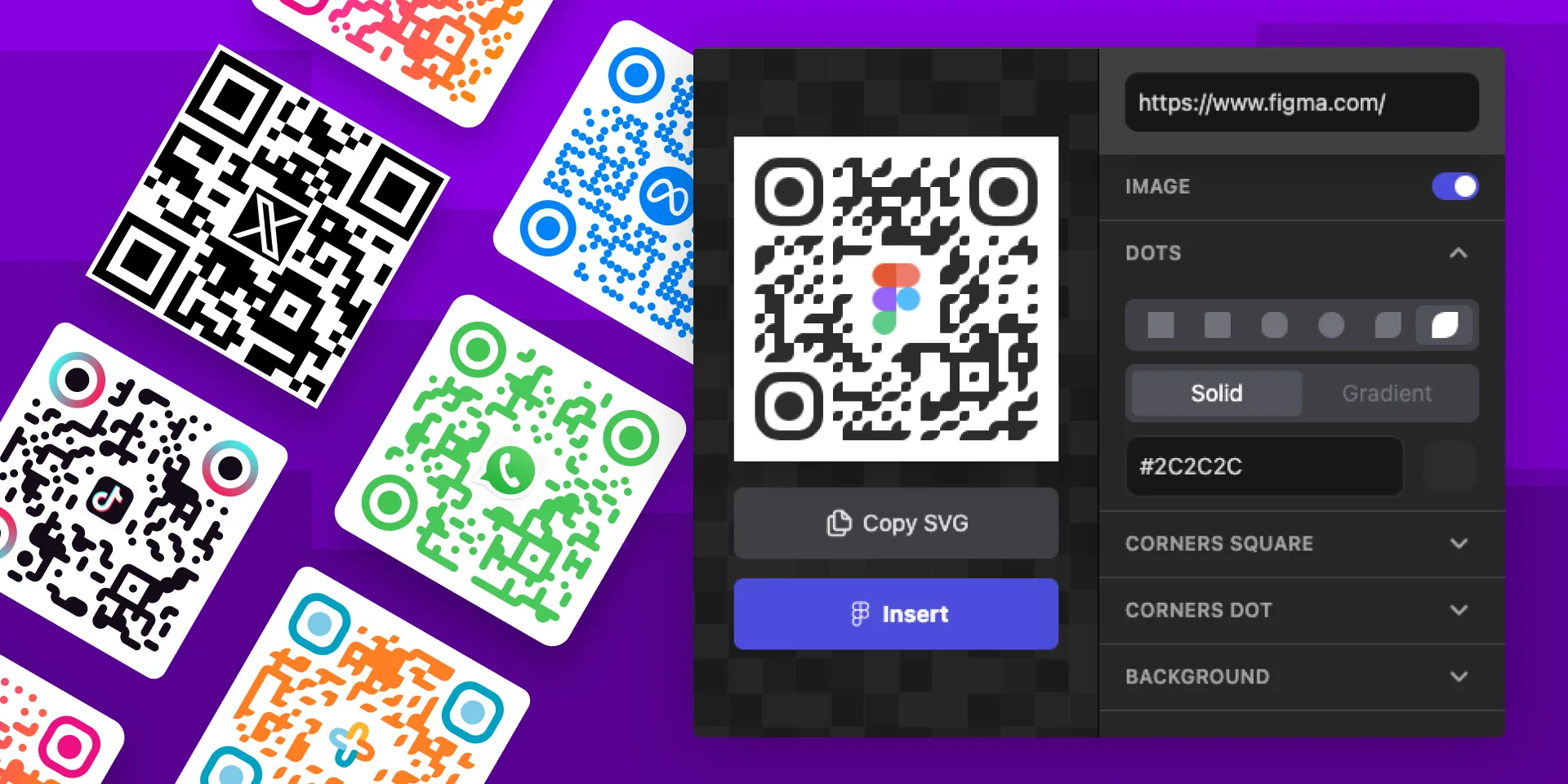
QR Code Gen Z
Seamless Waves Generator
SVG Patterns
Tailwind Blocks
Tech Stack & Design Stack Icons
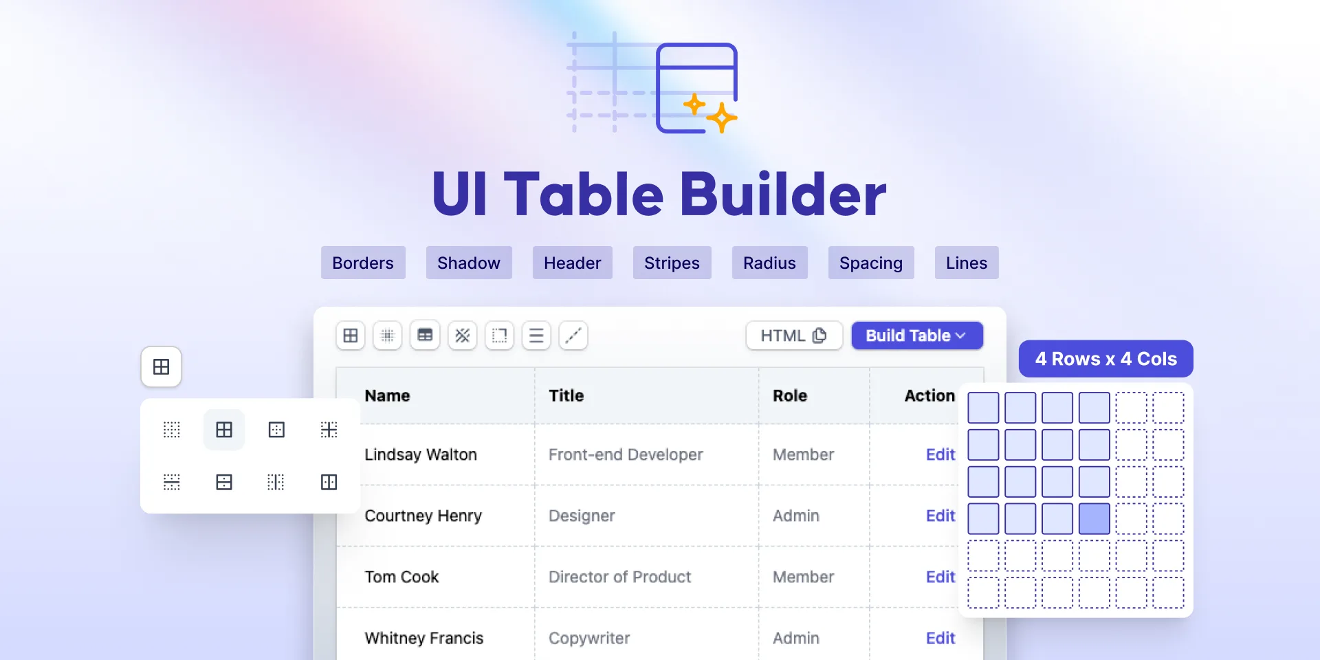
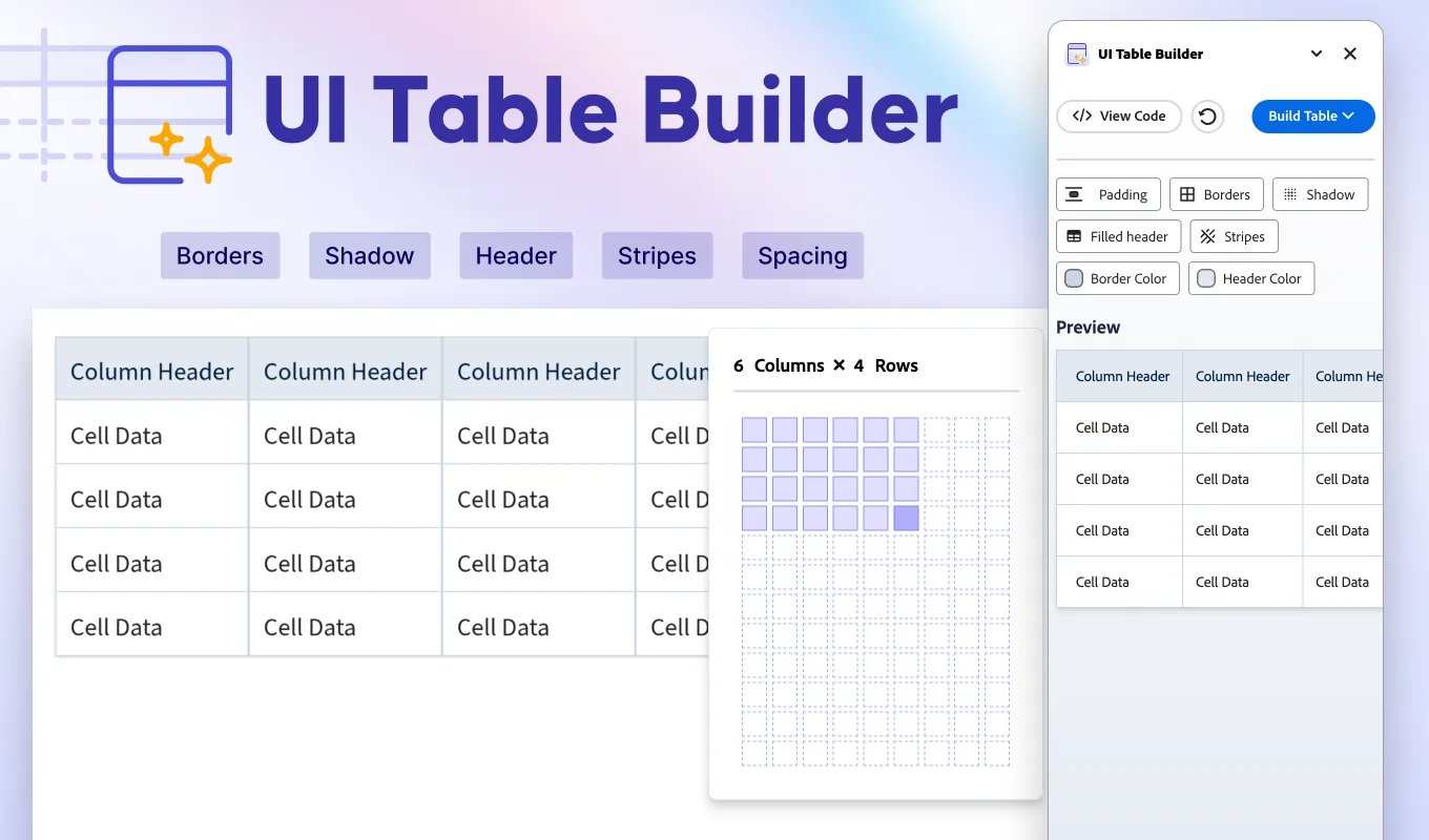
UI Table Builder
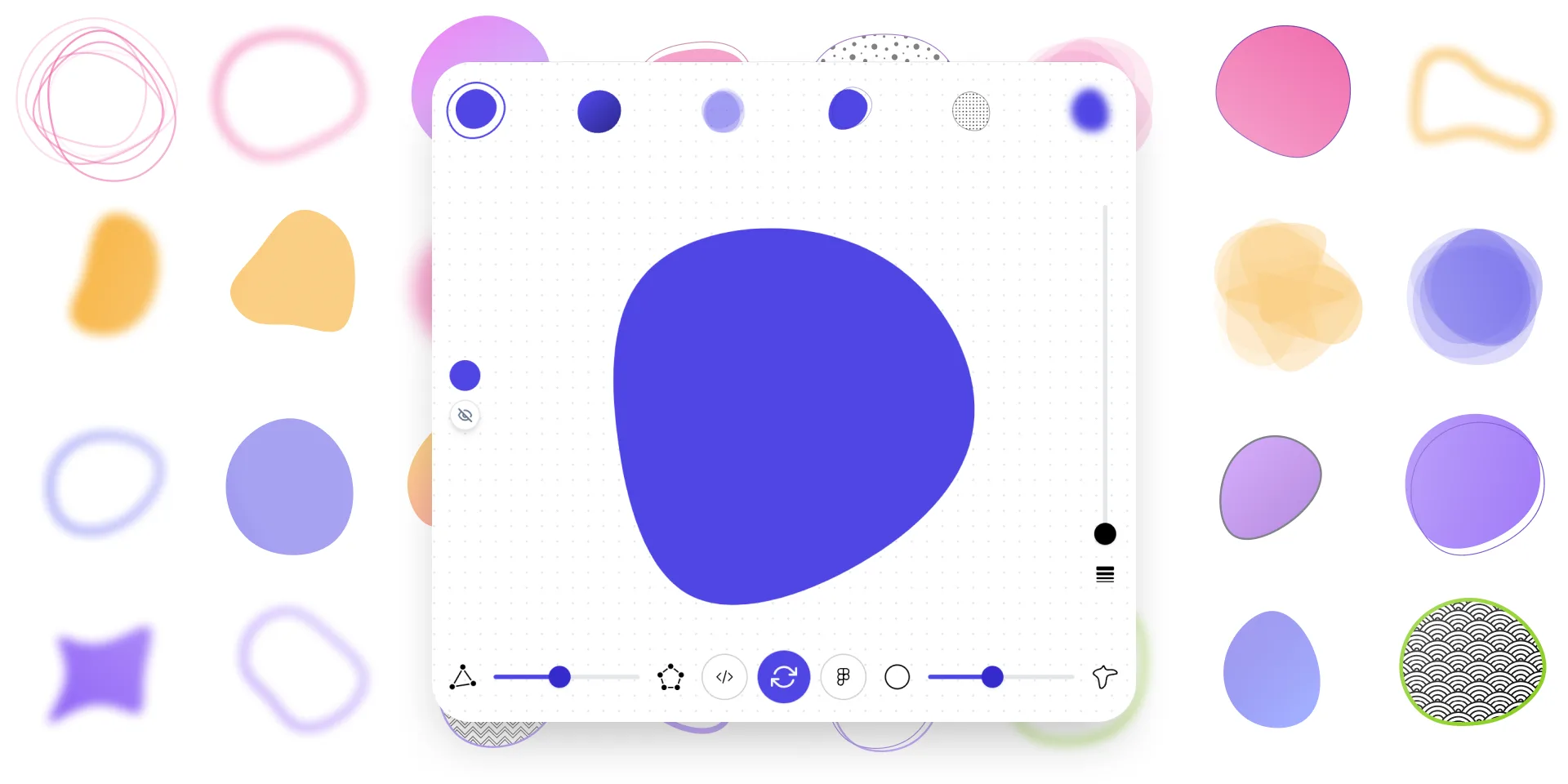
Ultimate Blob Maker Designer
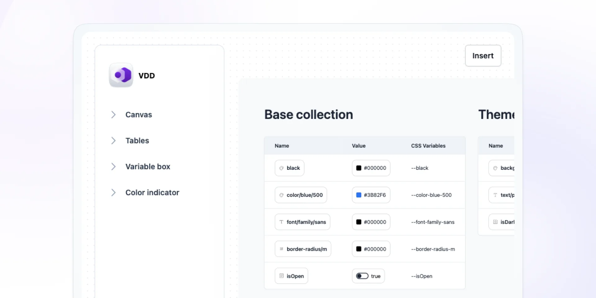
Variables Doc Designer
Add-ons for Adobe Express
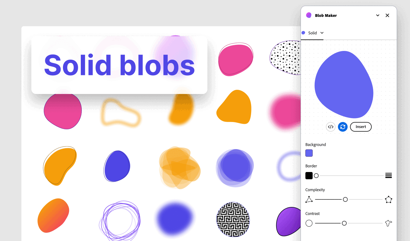
Blob Maker
Clip path generator

Liquid Metal Generator
Neumorphism Shadow Generator
Pixel Art Generator
Polygon Background Gen Z
UI Table Builder
Miro Apps
Blob Maker
Clip Path Generator
Iconiverse
Liquid Metal Generator
Neumorphism Shadow Generator
Pixel Art Generator
Polygon Background Generator
Tech Stack & Design Stack Icons