Iconiverse React
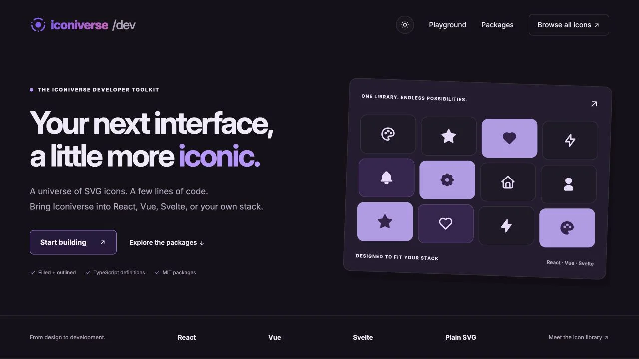
Bring filled and outlined Iconiverse icons into React interfaces. Set size and color through component props and use SVG attributes for styling and accessibility.
Install
npm install @plusuidesign/iconiverse-react
Or use your preferred package manager:
pnpm add @plusuidesign/iconiverse-react
yarn add @plusuidesign/iconiverse-react
Basic usage
import { HeartFilled } from "@plusuidesign/iconiverse-react";

export default function Example() {
  return <HeartFilled size={32} color="#8b5cf6" aria-label="Favorite" />;
}
Compatibility
React 16.8, 17, 18 or 19, as declared by the published package. The version checked for this page is 0.1.2. The npm package page lists the latest release, README and full API.
Explore the library
Try the Iconiverse playground to preview icons and generate framework examples. Browse the icon library.
Explore the related website, or browse all Plus UI npm packages.


