
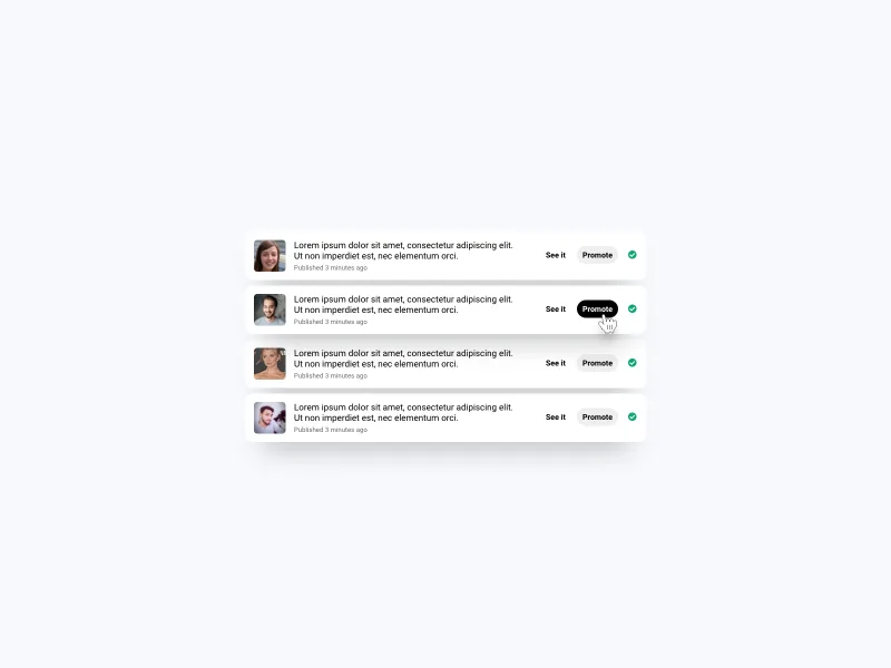
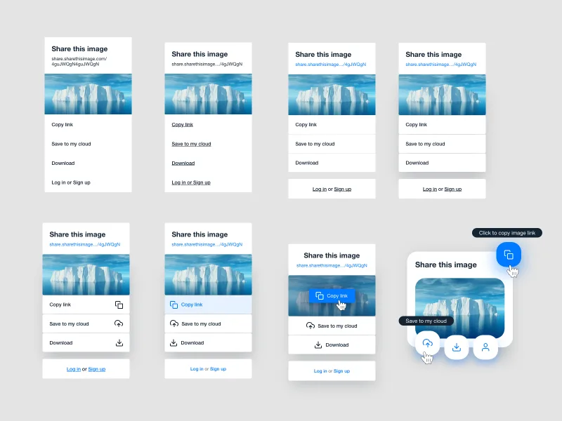
Share image ui component progression
This is a design progression to showcase how changing a few things in each iteration it can lead to huge visual impact for the user. Just by changing the link color or adding an underline makes it easier to identify the different elements on the design and distinguish what's clickable and what's not.
By the end of the iteration I've created something more trendy design that could work best for desktops.
Source file includes what you see on the image
Some colors from the color palette
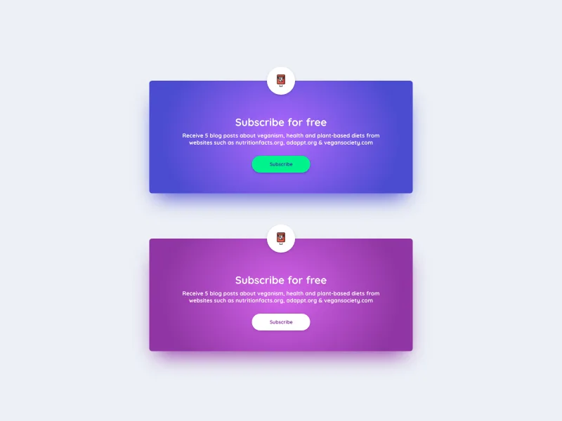
Download it to see all the colors5vegan Call To Action
0
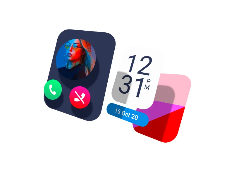
Adobe XD 3D transforms
0
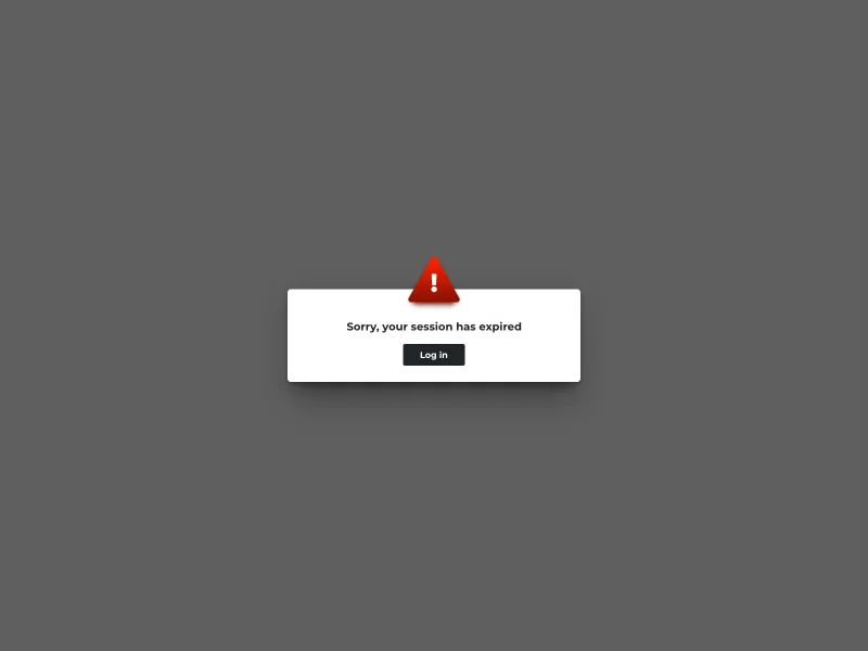
Alert Popup
0
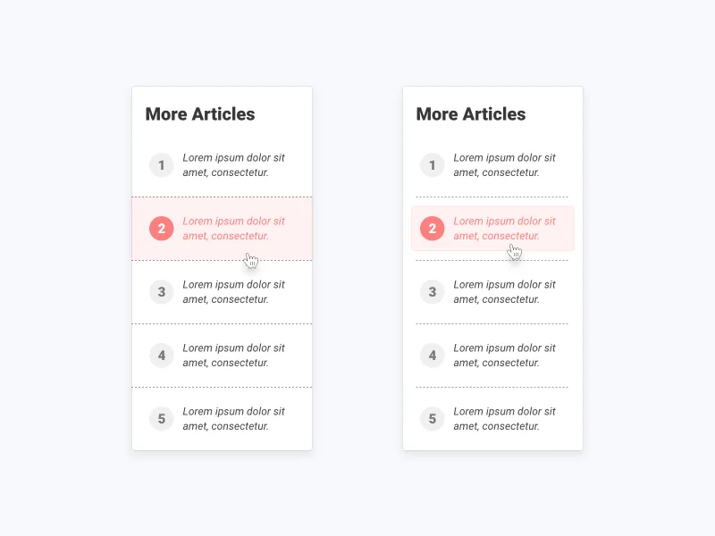
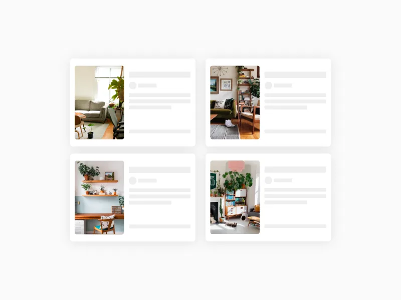
Blog post card list
0
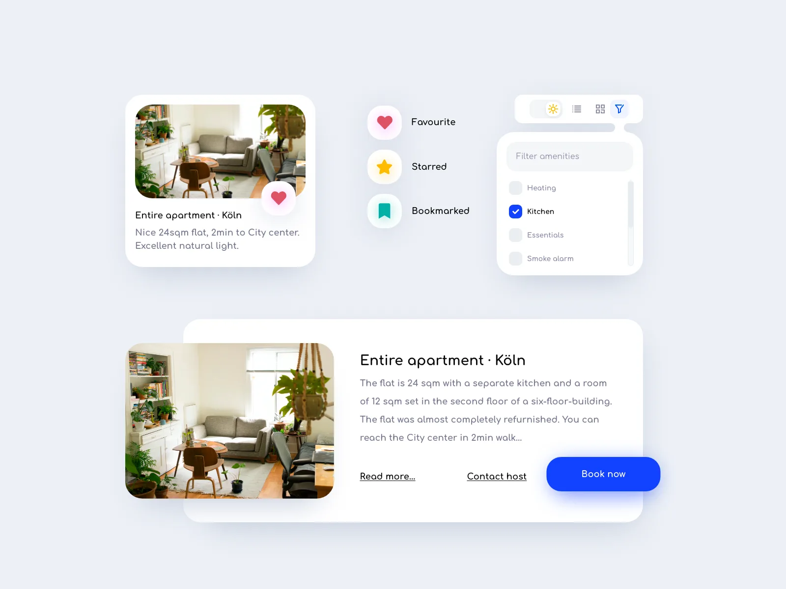
Booking accommodation web app
0
€4.99
Card list items
0
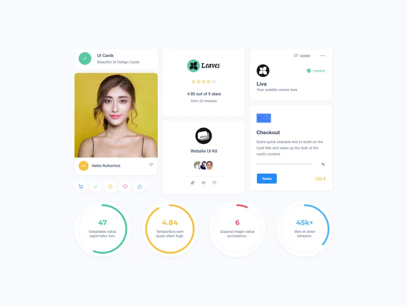
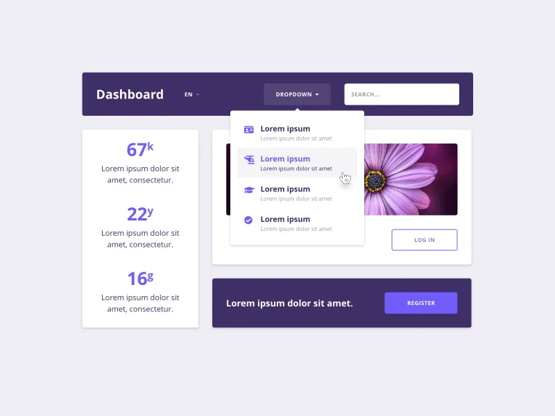
Chart and cards ui components
0
€9.99
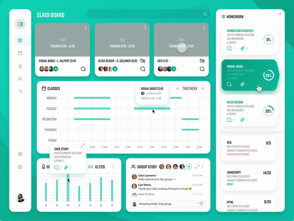
Class room dashboard
0
€14.99
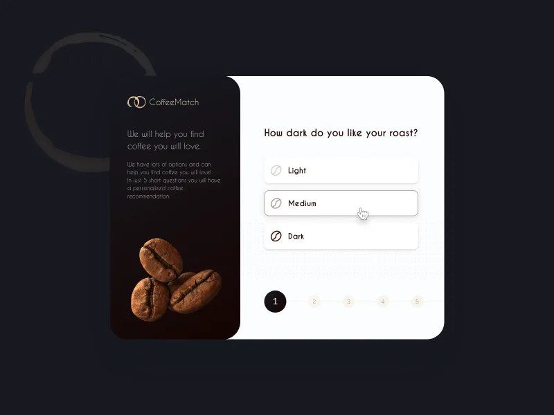
Coffee user journey card
0
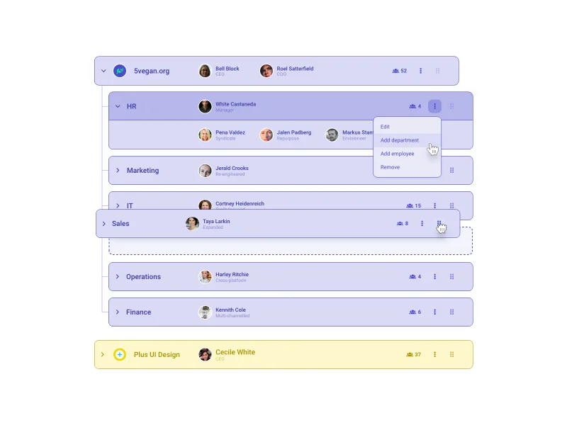
Company structure ui component
0
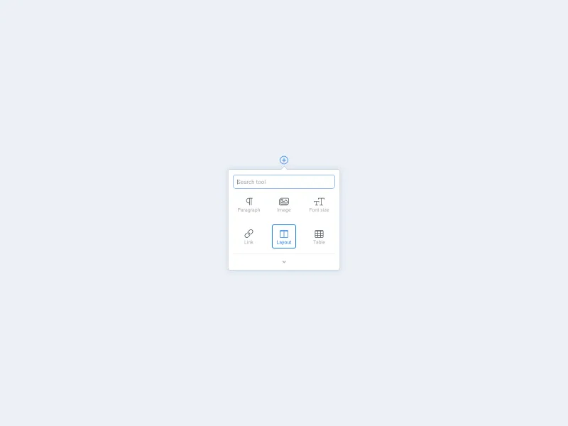
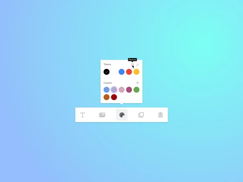
Content editor ui component
0
Content editor ui component
0
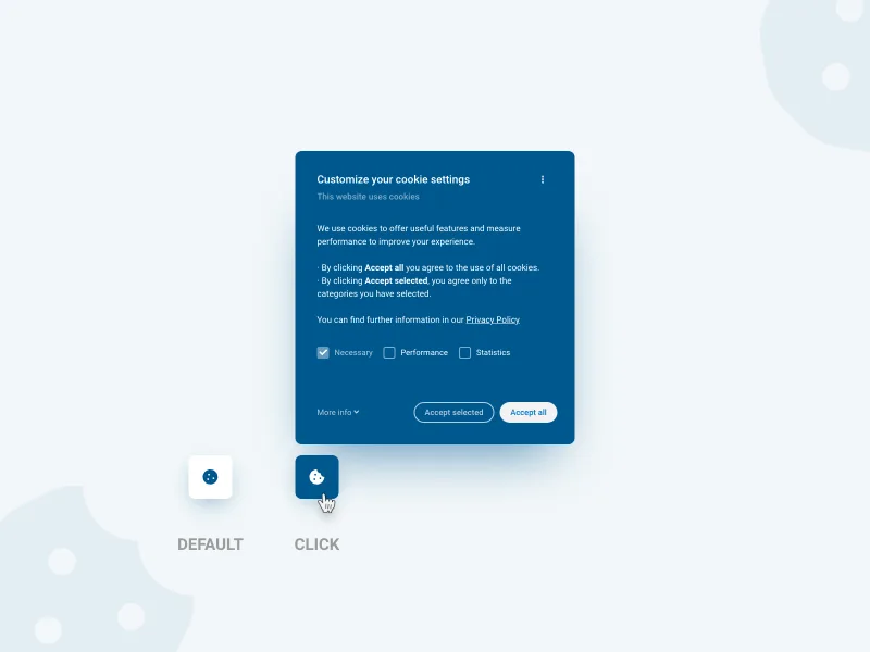
Cookie popup
0
Drag and drop cards
0
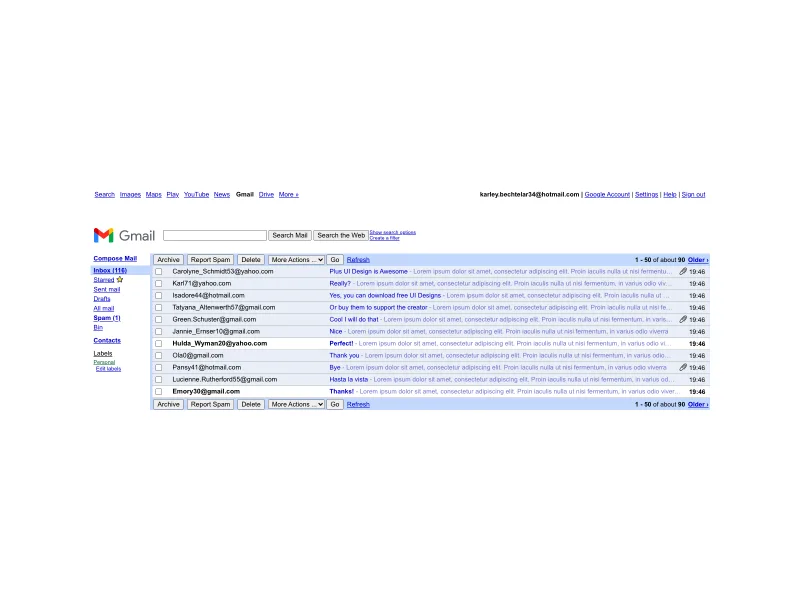
Gmail ui old
0
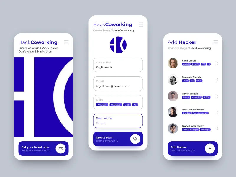
Hackathon coworking app
0
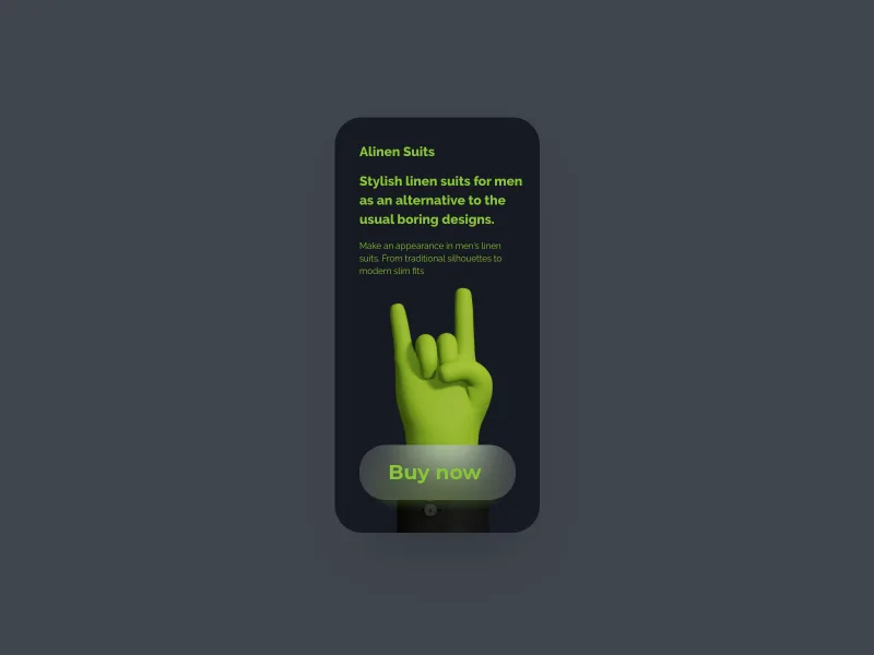
Handz banner
0
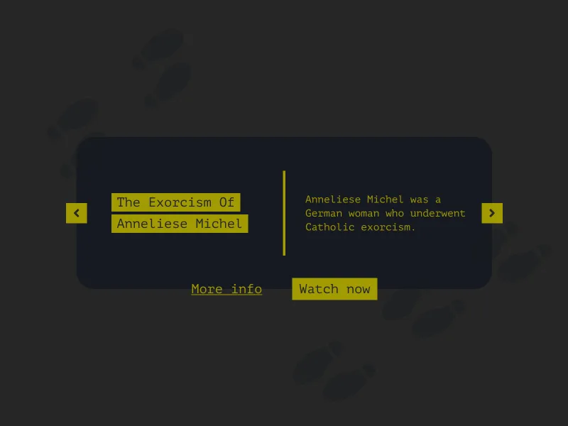
Movie card carousel
0
Navbar ui components
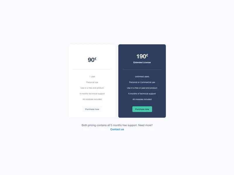
Pricing cards
0
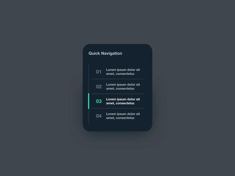
Quick navigation
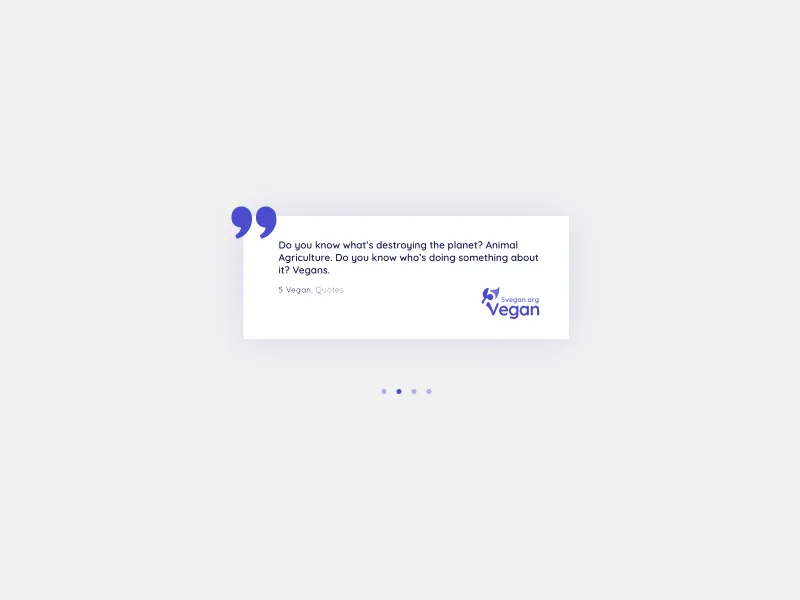
Quote card carousel
0
Real estate cards wireframe
0
Share image ui component progression
€4.99
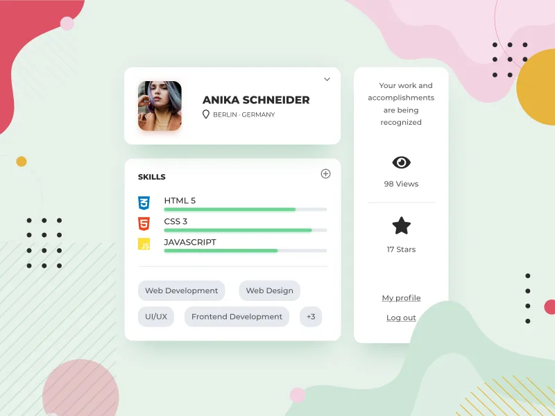
Skills profile card ui
0
Spotify mac dark theme
0
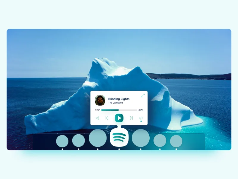
Spotify mac default ui
0
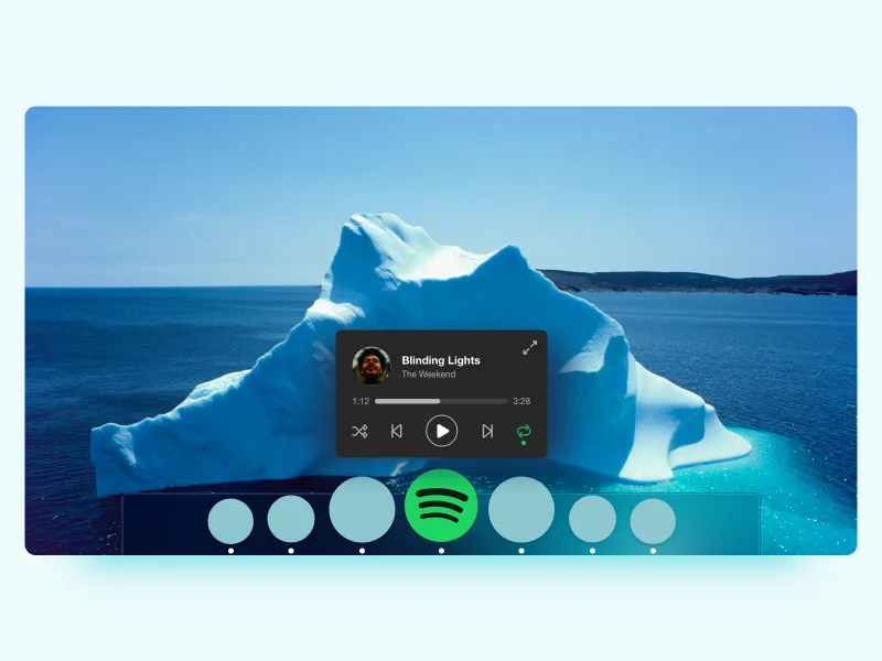
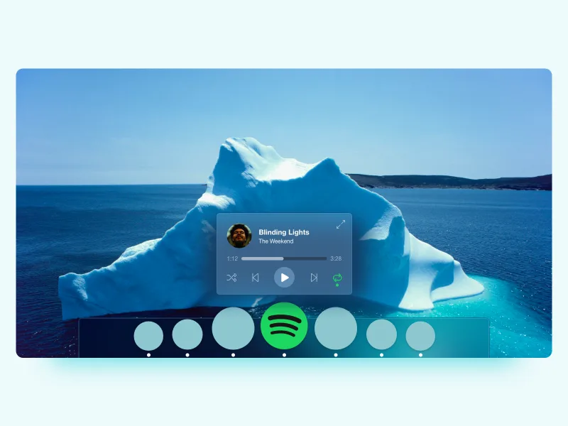
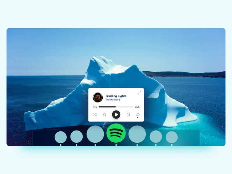
Spotify mac dock popover
0
Spotify squircle
0
€7.99
Sprint planning ui component
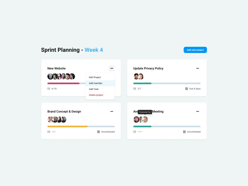
0
€9.99
Storage ui components
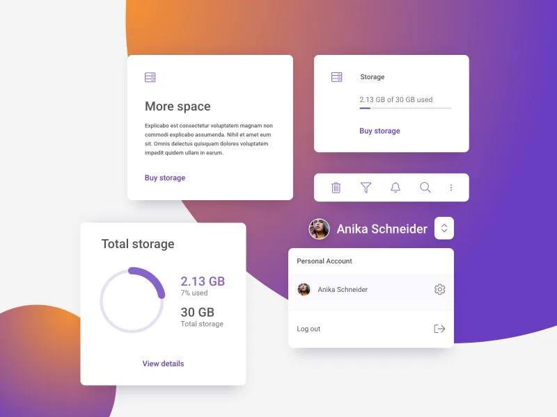
0
€9.99
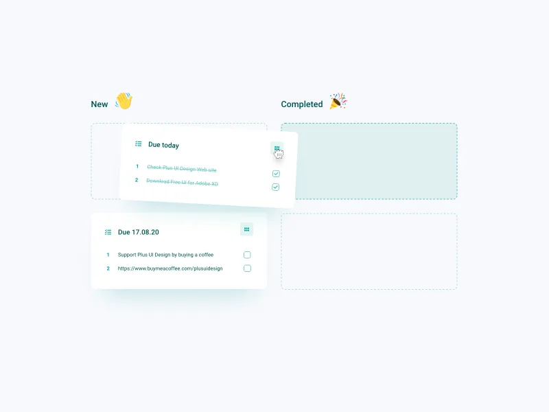
Todo list blog list
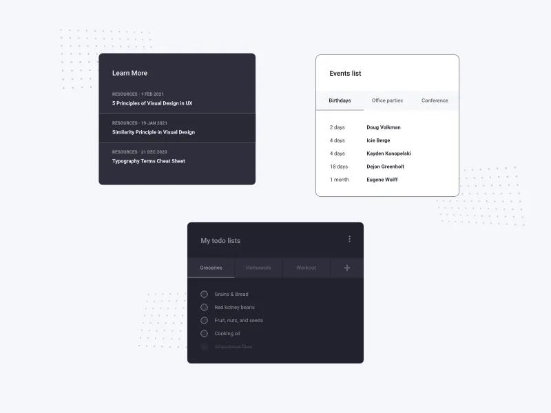
0
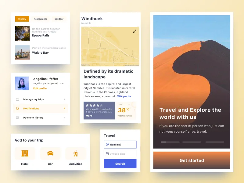
Travel organizer web app components
0
€9.99
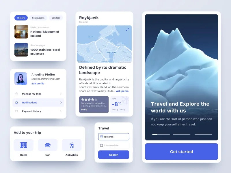
Travel organizer web app components
0
€9.99
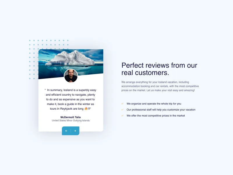
Travel website hero section
0
Zoho logo re-design prototype
0